
Click. Wait. Click again. Wait longer.
That’s the soundtrack of a poorly designed veterinary software platform and a sure‑fire recipe for burned‑out staff.
User experience (UX) isn’t just about slick buttons and trendy fonts. In a busy animal hospital it directly impacts appointment throughput, client satisfaction, and revenue per hour. Yet many practices commit to platforms that look great in a demo but feel like wading through molasses in daily use. The good news: you can catch most UX deal‑breakers before you sign a contract if you know exactly what to look for.
This article covers:
- Why UX is the Silent Profit Lever in Veterinary Practices
- The Eight User‑Experience Checkpoints That Reveal Clunky Software
- Step‑by‑Step: Running a 20‑Minute Usability Stress Test
- Case Study: How Oak Ridge Vet Saved 10 Hours/Week by Spotting Clunk Early
- Integrating UX Scores into Your Vendor Scorecard
- Action Plan & Downloadable Checklist
By the end you’ll wield a repeatable, data‑driven process to separate user‑friendly champions from click‑heavy pretenders long before a binding contract lands on your desk.
1. Why User Experience Dictates Clinical Efficiency and Profitability
1.1 Time Is Medicine (and Money)
Every extra click at checkout delays the next client, bottlenecking exam‑room turnover. According to the 2023 AAHA Survey, practices lose an average of 7.5 minutes per client to inefficient software navigation. Multiply that by 40 appointments a day and you’re leaking five clinical hours, half a technician shift.
1.2 Staff Morale Is UX‑Sensitive
Veterinary technicians ranked "slow, confusing software" as the #2 driver of workplace frustration (behind short staffing) in VetSoftwareHub’s 2025 Tech Satisfaction Survey. Happy techs mean lower turnover; lower turnover means fewer overtime dollars spent training replacements.
1.3 Client Perception Is Screen‑Deep
Pet owners may never see your backend screens, but they feel the ripple effects: longer waits, check‑in paperwork snafus, missed reminders. Smooth UX upstream equals smoother client journeys downstream, translating to better online reviews and higher loyalty.
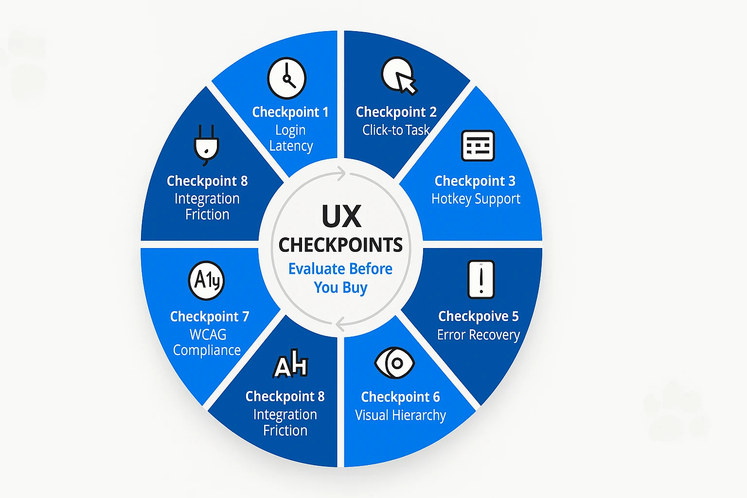
2. The Eight User‑Experience Checkpoints That Reveal Clunky Software
Pro Tip: These checkpoints are vendor‑agnostic. Use them on sandboxes, trial logins, or even recorded demo videos to score usability before committing.
2.1 Login Latency (Target: <3 seconds)
Time to first screen sets the tone. Anything past three seconds triggers the brain’s impatience response, according to Nielsen Norman Group research. Simulate real clinic bandwidth (Wi‑Fi + multiple browser tabs) to capture honest latency.
2.2 Click‑to‑Task Ratio
Count the clicks from dashboard to completing a core workflow e.g., updating a SOAP note or refilling a prescription. Aim for ≤7 clicks on high‑frequency tasks. Every extra click compounds fatigue over hundreds of repetitions.
2.3 Keyboard vs. Mouse Dependency
Keyboard shortcuts can shave seconds off repetitive data entry. Does the platform support Tab navigation and hotkeys? A 2023 Cornell Vet Tech study found keyboard‑savvy UIs cut charting time by 22%.
2.4 Mobile Responsiveness & Touch Targets
With curbside consults and farm calls, mobile is more than nice‑to‑have. Test on a tablet and a phone. Are buttons at least 44 pixels tall? Pinch‑zoom is a red flag for poor responsive design.
2.5 Error Recovery Flow
Intentionally trigger a common error: duplicate client entry, expired card, or missing weight. Clunky software throws a cryptic alert. Good software offers inline guidance and a single‑click fix. Track seconds to recovery.
2.6 Visual Hierarchy & Cognitive Load
Open a random screen for five seconds, then look away. Can you recall where the primary action button sits? If not, the layout likely violates Fitts’s Law and tires the eyes.
2.7 Accessibility Compliance (WCAG 2.1 AA)
Color-blind staff and those with reduced vision need contrast ratios > 4.5:1. Run the website through a free contrast checker. Failure here hints at broader neglect of detail.
2.8 Integration Surface Friction
Navigate to the section that launches lab orders or email campaigns. Are integrations deep‑linked with pre‑filled data, or do you copy‑paste patient IDs? More toggling means more mistakes.
Checkpoint Tracker: Download our UX Checkpoints Spreadsheet (link in Action Plan below) to score each area 1‑5 and generate a weighted UX grade.
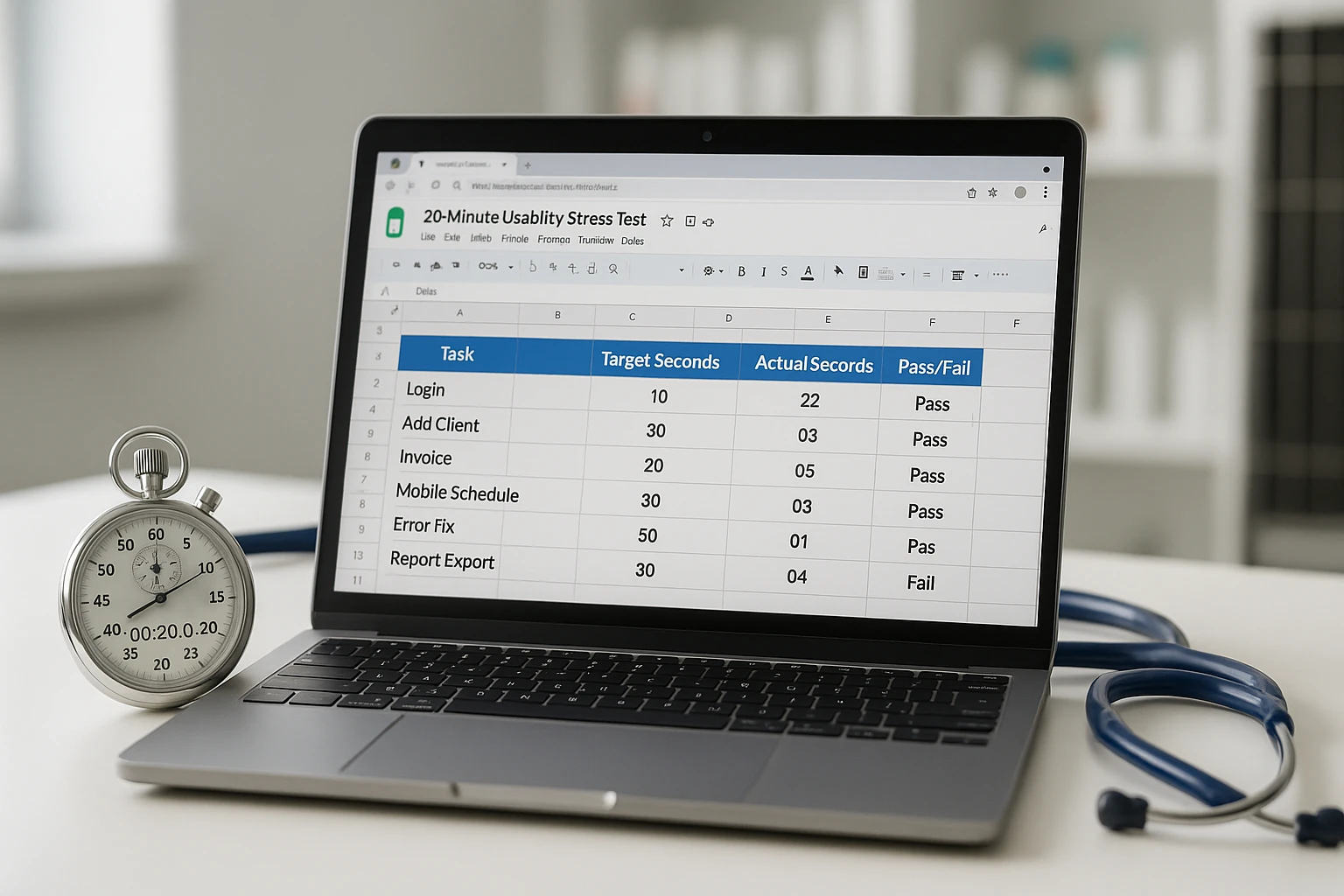
3. Step‑by‑Step: Running a 20‑Minute Usability Stress Test for Practice Management Software
You don’t need a formal UX lab; just a laptop, a stopwatch, and a curious tech.
| Minute | Task | What to Record | Pass/Fail Threshold |
| 0-2 | Login | Seconds to dashboard load | ≤3 seconds |
| 2-6 | Add new client & patient | Clicks + dropdown clarity | ≤12 clicks |
| 6-10 | Create invoice with 3 items | Error prompts, keyboard shortcuts | No manual mouse dragging |
| 10-14 | Schedule follow up appointment on tablet | Touch target accuracy | No pinch-zoom required |
| 14-18 | Trigger duplicate record error | Seconds to resolve | <10 seconds |
| 18-20 | Export daily summary | File type options | CSV/XLS available |
Sum the checkpoints. Anything scoring <70% likely causes daily friction.
Who should run the test?
- Lead technician - Heavy daily user.
- CSR - See check-in and billing screens most.
- Associate DVM - Validates clinical workflow relevance.
Assign each a single taks to keep evaluation under 20 minutes.
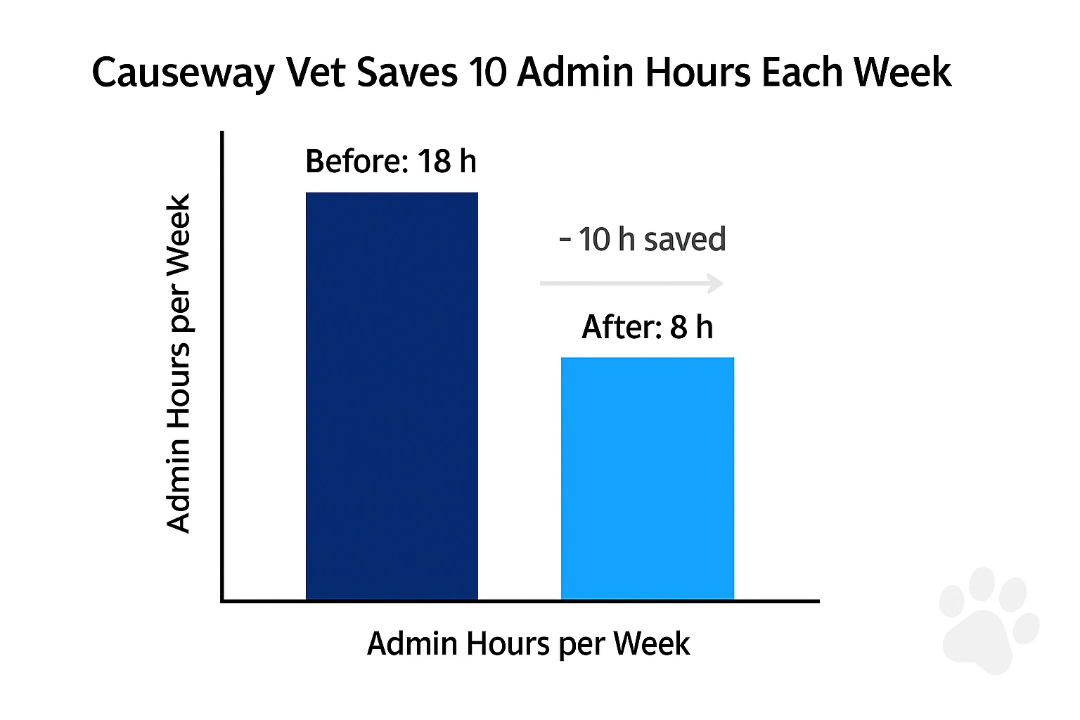
4. Case Study: Causeway Vet Spots Clunk, Saves 10 Hours/Week
Causeway Veterinary Hospital, a five-doctor small animal practice on the East Coast, almost signed with a cloud based practice management software they discovered at a conference. Before finalizing and with our help, they were the first to run our 20-minute stress test.
Red Flags Uncovered
- Click-to-Task Ratio: 15 clicks to complete invoice, double their current system.
- Mobile Responsiveness: Buttons overlapped on their iPad Mini.
- Error Recovery: Duplicate client alert forced a full page reload.
Outcome
Armed with objective data, Causeway pressed the vendor for roadmap clarity and negotiated a three-month pilot instead of being locked into a system they were unsure of. They later switched to a different solution, which scored 85% on the UX checklist and reduced weekly admin hours by 10.
The checklist saved us from a major headache. Our techs actually like entering data now. - Dr. Miller, Causeway Vet
5. Integrating UX Scores into Your Vendor Scoredcard
Good UX shouldn't sit in a vacuum. Add "User-Experience Composite Score" as a weighted category on your Vendor Scorecard. Suggested weightings:
- 20% for Core Functionality Match
- 15% for UX Score (derived from checkpoints)
- 15% for Integration Depth
- Remaining 50% for pricing, support, security, etc
Software may boast hundreds of features, but if those features are buried under clunky navigation, your staff won't use them and ROI will plummet.

6. Action Plan & Downloadable Resources
- Grab the UX Checkpoints Spreadsheet - Pre-loaded with formulas for composite score.
- Schedule a 20-minute stress test with your lead tech tomorrow.
- Log scores and update your vendor scorecard.
- Share findings in your next leadership meeting to steer purchasing toward staff-friendly platforms.
Additional Resources
- A 10 Minute Framework to Short-List Software Without Talking to Sales
- Vendor Scoredcards: Compare Any Two Veterinary Software Platforms
- Staff Buy-In Hacks: Turning Software Skeptics into Champions
Conclusion
User experience is the front line between software hype and day‑to‑day clinic reality. By running eight simple checkpoints and a 20‑minute stress test, you’ll identify clunky contenders before they siphon time, money, and morale from your team. Add the UX composite to your vendor scorecard, and you’ll not only pick the right platform, you’ll future‑proof your practice’s efficiency for years to come.
Ready to kick the tires on your top software picks? Download our UX Checkpoints Spreadsheet and let the stopwatch be your truth serum.
Time spent reading: 11 minutes. Time saved on future headaches: priceless.
Footnotes
- AAHA Survery, 2023.
- VetSoftwareHub Tech Satisfaction Report, May 2025
- Nielsen Norman Group, Interaction Design Basics, 2023.